

.png)
Cool It! was born out of the 2020 DC Climathon Event, which was aimed at reducing the incidents of hyperthermia and heat related deaths in the city.
Client
Natalia Blewonska
Timeline
3 Weeks
Team
Becky Baumann
Sophia Kane
My Role
UI Lead
UX Designer
Deliverables
High - Fidelity Mockups, Prototype, Brand Guide
Over the past decade, daily record temperatures have occurred twice as often as record lows across the continental United States. A recent study projects that the annual number of days with a heat index above 100 degrees F will double, and days with a heat index above 105 degrees F will triple, nationwide.
Extreme heat is exacerbating urban heat disparities in cities like Washington, DC.
EPA researchers project heat-related deaths could increase from 3,500 to 27,000 by mid-century.
Hyperthermia results in approximately 4,100 emergency room visits annually.

The Problem
While heat waves become more common and intense, resources and emergency assistance should be provided to those people at the moment they may need it most.
Scope
-
A visual indicator of the current heat index and associated risk levels specific to a user’s current geographical location
-
Precautionary recommendations specific to heat emergency risk levels
-
An interactive, hourly forecast of heat index values, risk level, and recommendations for tips to stay cool during a heat emergency
-
Signs and symptoms and first aid information for heat-related illnesses
-
Easily find a Cooling Center
-
Notification system to issue heat emergency alerts

Proto-Personas

As an elderly person without air conditioning, I need to know when a heat wave is coming so I can make a plan with my family and neighbors

As a person experiencing homelessness, I want to be able to find and get to a cooling center or another safe, air conditioned place.

As an outdoor worker, I need to be able to check the heat index and weather for the day so I can plan accordingly.

As a pregnant woman, I want to be able to find air conditioned places near me in case I need to stop and rest on my way home from work

As a concerned community member, I want to make sure myself and my neighbors are aware of and prepared for heat waves.
Research Synthesis
Competitive Analysis


Secondary Research
There is no application currently in the market that has all the features Cool It! wants to provide.
Among the government apps that help users find cooling centers, there is a gap in information between finding cooling centers and getting to cooling centers.
The information and resources most useful in an extreme heat event are spread across many different apps and sites, requiring people to know of, have access to, and use a variety of tools in an emergency situation. Inconvenient to say the least.
Cell Phone Access
A substantial majority of Americans own cell phones across a wide range of demographics. Smartphone ownership is more dependent on age, household income, and education.

Cooling Center Usage
What is a
Cooling Center?
Cooling centers are air-conditioned public spaces set up by local authorities to temporarily deal with the health effects of a heat wave.
Cooling centers are meant to prevent hyperthermia caused by heat, humidity, and poor air quality.
The City of DC opens cooling centers when the temperature or heat index reaches 92 degrees F.
Since data on cooling center usage is not comprehensively collected in every city, county, or state, we expanded our Cooling Center usage research beyond DC. With that in mind we turned to CDC data from Maricopa County in Arizona to better understand the demographic breakdown of cooling center users.


Visitors by Gender
Housing Status

Chronic Medical Condition


Employment Status
Air Conditioning Status

Feel Safe and Secure at Cooling Centers

Age Group


Be able to use AC
Feel Vulnerable to Heat Weave

Barriers to accessing cooling centers
-
Being hesitant to travel to an unfamiliar place
-
They would sit in a room with nothing to do
-
Don't want to leave their home, or leave their animals alone
-
Not located near a bus route
-
Don't want to wait at a bus stop on a hot day
“People are more likely to use such centers if they are a part of everyday life.”
“People prefer to go somewhere cool where there is an activity they want to be doing, such as going to the mall, rather than just going to a community center to cool off.”
We set up a screener survey hoping to find people across our target user groups to speak to. We included questions specifically targeting experience with hyperthermia and access to air conditioning. However, limited by time, geography, and our personal networks. that ultimately didn’t leave us with many people to speak to since many of those outliers overlapped in some way. So we reluctantly expanded our interview group and refocused our questions to be more broadly about knowledge of heat emergencies, hyperthermia, and emergency and weather alert systems.

Main takeaways from the Interview
-
Convenience is key, when users learn about weather emergencies in general.
-
Users would seek out malls or other indoor places during heat emergencies. Along with the research shared earlier, it confirmed that we needed to expand what we considered as a Cooling Center in order that Cool It! to be more impactful.
-
There is a general lack of awareness of what hyperthermia is, what it’s symptoms are, what to do if you may be experiencing symptoms, and how to detect it and treat it early enough.
Personas
Personas

Opportunity
How might we design a web app that provides people with useful resources to survive extreme heat emergencies?

User Flow

Journey Maps
Mood Board

To get a general idea of how we feel about this app looks like, we started to develop the mood board, that visually illustrates the style we wish to pursue. We intentionally looked at design areas in weather app, map app, symptoms check app and alert system. At the same time, we wanted to capture the most iconic places of DC.


Combining elements on both the mood boards, we came up with the initial design theme. We designed the hero image having layers of DC skylines and landscape with gradient color rendering. To test accessibility, we tried different color schemes, and picked the one that passed the accessibility testing with best visually illustration.


We fleshed out our style guide based on the illustrations we created for the home page. The blue-greens were selected for their cool and calm qualities while the reds are used strategically to signal higher risk situations.
We had design studio through the whole design process. To test the better usability, we came up with different schemes with similar design elements, and discussed each scheme pros and cons, and selected the best layout that is more accessible and easier to use.

Design elements
How it works
Next, we tried to figure out what kind of information is needed to support each feature, and what components are designed to perform those functions.
-
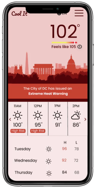
For Heat Index and Weather, we created different panels to provide hourly forecast of heat index values and risk level, weekly forecast, and easy connection to other features.
-
From the secondary research and interviews, we learned that users would prefer to stay alternative air-conditioned spaces where there is an activity they want to be doing. Besides helping users find a cooling center, we also designed the function of helping users find nearby air-conditioned spaces, like retail store, shopping malls and movie theaters, where users would like to stay. Learning from Map App design, we organized those places by services they provide, and created simple direction between the location of the user and them.
-
To avoid heavy text, Tip to stay cool was made by sections of information with concise points and easy connection to other features.
Landing Page

Language Switch

Main Menu
Precautionary recommendation of multiple location
Heat Index
Dynamic background tracking Heat Index
Navigation Bar
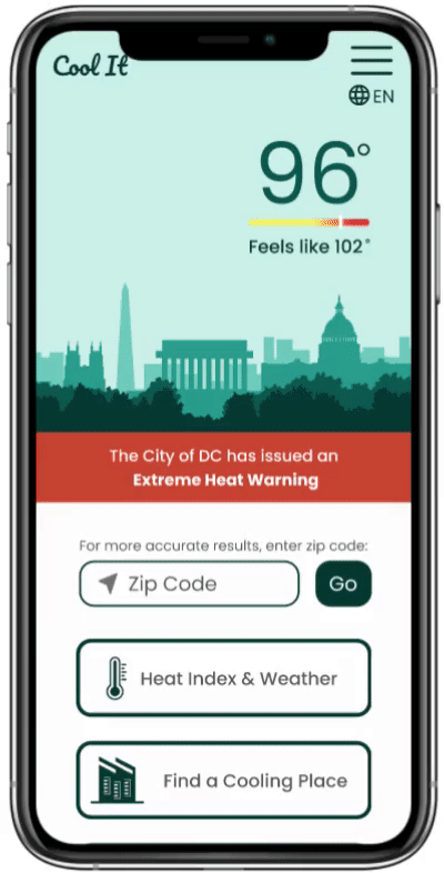
Heat Index & Weather

Navigation Bar
Dynamic background tracking Heat Index

Direct Access to Tips
Hourly forecast of heat index values and risk level
Weekly forecast
Finding a Cooling Center
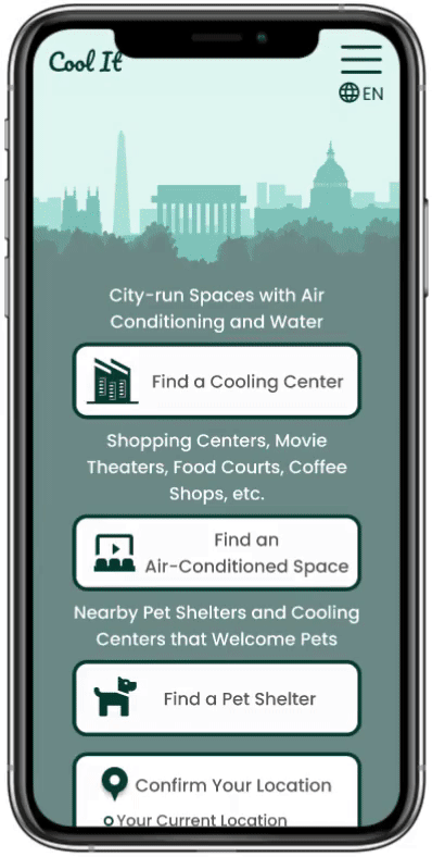


For all animal emergencies, including animals left outside in extreme temperatures or in vehicles.


Provide Direction based on Live Data
Direct Call for Transportation Assistance to a Cooling Center
Check Symptoms


Easy Connections to Other Feathers
Dynamic Panel of Item Selection
Result Cards to Provide Relate Tips to Stay Cool
Direct Access to Emergency Call

What is Extreme Heat

Easy Connections to Other Feathers
Breakdown Info by Age, Health and Living Condition
Dropdown Info for Each Condition

Tips for Each Condition

User Testing
We conducted usability tests on our mid-fidelity prototype. 3 moderated over zoom and 3 unmoderated on usertesting.com. We drafted a series of tasks for users to perform and presented them with scenarios as a narrative framework for why they would be using each feature. Based on feedback from these tests, we iterated with the following recommendations in mind.
-
Explain somewhere on the site what hyperthermia and heat index are
-
to make the heat stroke warning page look less interactive
-
Redesign SOS image so it doesn’t look like a button
-
One confirmation page for text alert sign-up
-
Give users more information on what types of cooling centers are on the map
Example of Iteration

.png)
Changed the background to white for contrast and consistency
The SOS logo was mistaken for a button in user testing, so we removed it
Added Language Switch button for non-English Speakers
Added clickable resource for animals exposed to the heat
What's Next
-
More in depth testing on each of the features with users in hyperthermia high-risk categories
-
Continued iterations on each of the features based on testing feedback
-
User research with targeted high-risk populations
-
Partnerships with City of DC and local businesses to provide access to more residents